These interface mockups were created as part of the Season of Usability 2008
You can find an interactive version of the mockup here http://jkwebs.de/gallery/prototype
Link to the upload feature
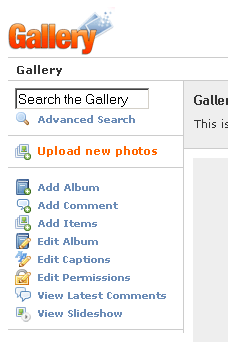
- A link to upload feature should be available from any page within Gallery
- You don't have to navigate to an album first
- The link should be prominent so that a new user can find it immediately
Upload Lightbox
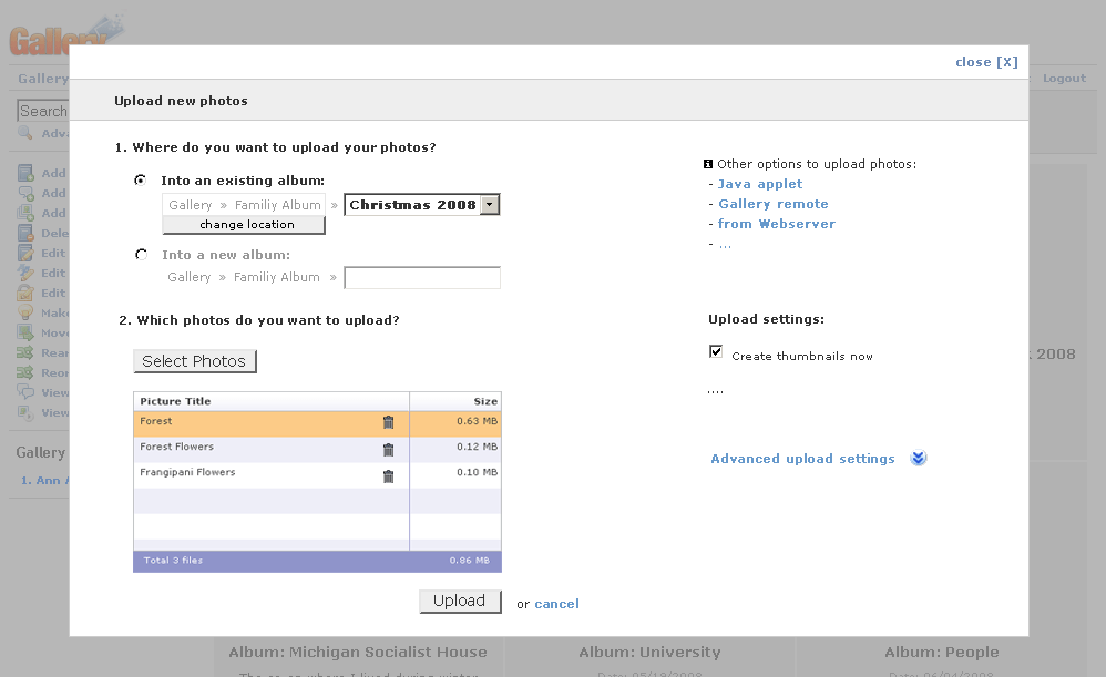
- A lightbox since it doesn't make sense to navigate around while you are uploading photos
- A lightbox allows for more screen space and better concentration on the relevant elements
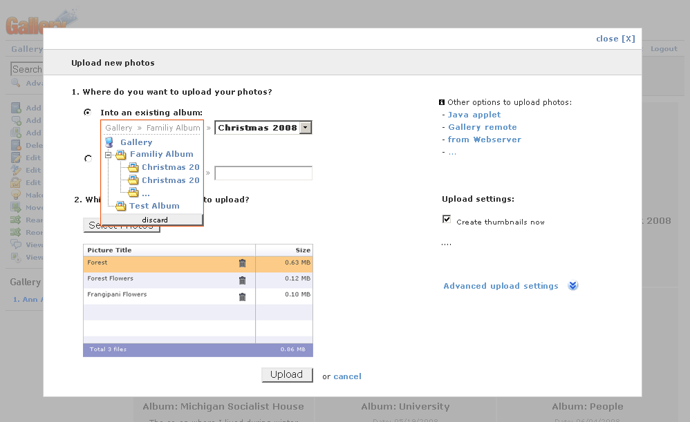
- the "change location" button under the album selector could be only shown on mouseover
Adding metadata
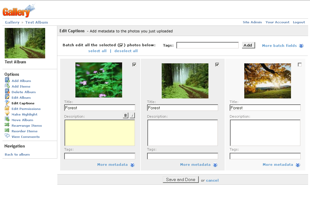
- improved version of the crrent 'Edit Captions' page. The same interface would be used to edit captions for an existing album.
- adding metdata happens outside of the lightbox, since it is a somewhat optional step
- the formatting toolbar: 1. only exists for the description field; 2. is limited to the most important formatting commands (bold, italics, maybe more); 3. only appears when the focus is on the corresponding field
- more metadata fields (location, date, time, ...) can be revealed by clicking on 'more metadata \/'
- there is a field to "batch add" tags to all the uploaded photos
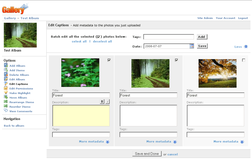
- on a general note: the 'save', 'cancel', whatever buttons should not be placed on the left. because humans scan the screen from top-left to bottom-right. i would suggest to put all the buttons either on the right (or if that is a problem with widescreen resolutions) in the middle (as in this screen)