X_treme Theme :: extreme customization
X_treme provides complete control of album and photo pages by requiring site administrators to specify settings and select options allowing almost everything to be changed, the position, the color, the style.
This Theme needs at least Gallery Version 2.2, Core 1.1.17 Theme API 2.4 and Core API 7.0 are required to install this theme and to benefit of the Gallery 2.2 features like Virtual Albums!.
Information
Initially based on Matrix, PGtheme was developed thinking of people with difficulties changing Themes code, so that anyone could customize their Gallery appearance simply by specifying options on the theme administration page.
X_treme is what we can call the youngest brother of PGtheme, it's more than a new version but you will see several old options, now cleaner and with even more choices.
Some of the most interesting features
- Several external links on top menu
- Floating side bar with album and items options, displayed on mouse right click and by a link
- A welcome message for each album, displayed at first page or also on other pages
- Options to display statically or floating several item information
- Blocks to show in the sidebar, album, and photo pages, on several locations
- Buttons linking to floating boxes with comments, exif, and other blocks
- Thumbnails from previous and next item on mouse over the photo
- Popup with full image
- Micro navigation thumbnails configurable
- Possibility to chose what information and where to show it (eg.: title, description, summaries, etc)
- On mouse over actions using almost exclusively CSS
- Several options allowing to override style sheets an theme definitions
- Interactive frame extremely configurable allowing to change size colors and display text on it
- Album, item, and photo frames
- Color pack
- Several Icon packs
- Footer customizable
Demos, Downloads and Forum
Demo: PedroGilberto.net,
themes.gallery2.hu
Downloads: PedroGilberto.net,
Browse Subversion Repository
Forum: X_treme Development Forum
User-Defined Settings
Rows per album
Columns per album page
Show micro navigation thumbnails
Color Pack
Select different color palettes to use with the theme.
- Module: ColorPack must be active.
- Downloads: 54KB(zip), 15KB(tar.gz)
All color packs should work but X_treme ones will change some icons according the colors and display an identifying icon on footer.
Select the Blocks you want to be shown in the sidebar.
Blocks to show on album pages
Select blocks to be shown on bottom of album pages (or floating if selected).
- Will be shown as selected at:
- "GLOBAL - Blocks :: Position Blocks Table with selected Blocks to show at bottom of page" and
- "GLOBAL - Blocks :: Align the Blocks inside Blocks Table"
- Will be shown inside a floating box if the option:
- "ALBUM :: Display a "Blocks" button (when clicked Blocks selected to show: containing EXIF, Comments,etc, will be displayed on a floating box)"
- is selected
Blocks to show on photo pages
Select blocks to be shown on bottom of photo pages (or floating if selected).
- Will be shown as selected at:
- "GLOBAL - Blocks :: Position Blocks Table with selected Blocks to show at bottom of page" and
- "GLOBAL - Blocks :: Align the Blocks inside Blocks Table"
- Will be shown inside a floating box if the option:
- "PHOTO :: Display a "Blocks" button"
- is selected
GLOBAL
- Settings applied all over Gallery. Implemented at "theme.tpl".
Add png suport for IE older versions
Will be used a script for IE version 5.5 to 7 to allow PNG transparency.
When used (just for IE 5.5-7) the page will open only when all items are loaded, and logo onmousehover will not work.
Site ID. :: To display on page Title
Enter the text to be displayed on page title.
Logo :: Show on top page - select alignment
Display a Gallery home linked image as a logo on top left page.
Images should be uploaded into ".../themes/x_treme/templates/extra/logos/".
Logo :: Enter file name and extension
You can enter any you have uploaded into ".../themes/x_treme/templates/extra/logos/".
This option allow you to have a different logo to each album (default: logo.png).
Logo :: Enter logo hover file name and extension
You can enter other you have uploaded (default: logo_hover.png).
Logo :: Enter image Width (px)
You should enter the width (pixels) of the image you have uploaded and entered above to use as logo (default: 175).
Logo :: Enter image Height (px)
You should enter the height (pixels) of the image you have uploaded and entered above to use as logo (default: 50).
Banner :: Show on top of the page
You should customize "x_treme/templates/extra/banners/banner_top.tpl", in order to display text or images as you like (you could insert for eg. Google Adsense).
Banner :: Enter file name and extension
You can have different banners for each album, just upload the files into "...themes/x_treme/templates/extra/banners/" and enter file name and extension (default: banner_top.tpl).
Display any thing you wish at the bottom of the page. You should customize "x_treme/templates/extra/banners/banner_footer.tpl".
Banner :: Enter name and extension, to display on Footer
The same as for top banner.(default: banner_footer.tpl).
Choices are:
- None - no sidebar (useful for using x_treme with embedded gallery2)
- Floating - display a floating "Drag and Drop" Sidebar.
- Static - display a classic static Sidebar just like Matrix Theme.
Top Navigation :: Show where the user is (BreadCrumb)
If checked, display "BreadCrumb" on left side of top navigation.
Top Navigation :: Separator for items on BreadCrumb and Menu
Insert the character(s) to display as horizontal separator on "Top Menu" and "BreadCrumb".
(default: "|" - usage: /)
Top Navigation :: An external Link
Enter text to show on "Top Menu" as a link (up to 3 links).
(default: " " - usage: Link to My Other Site)
Top Navigation :: URL for this Link
Enter the URL to link the text inserted above (up to 3 links).
(default: " Home" - usage: http://www.pedrogilberto.net.)
Top Navigation :: More external Links
Show all the links you wish at "Top Menu", must customize "externalLinks.tpl" where you should add title(s) and url(s).
Blocks :: Position Blocks Table with selected Blocks to show at pages bottom
Choices are:
Blocks :: Align the Blocks inside Blocks Table
Choices are:
If "Cart" and "Checkout" modules are activated select the one or both to use with "Cart" buttons
Choices are:
- Use both - selected by user
- Use only "CART" module
- Use only "CHECKOUT" module
Thumbnail links in dynamic albums
Choices are:
- Browse dynamic album
- Jump to original album
- Separate link to original album
Mouse Right Click action
Choices are:
- None - do nothing.
- Disable Right Click context menu.
- Show a "Copyright Alert Message"
- Show Floating Sidebar and Right Click context menu
- - Show Floating Sidebar with current Options (the same as clicking "Options" on top menu) and also Right Click context menu.
- Show Floating Sidebar, no R. C. context menu
- - Show Floating Sidebar with current Options and disable Right Click context menu.
- Show Floating Sidebar and "Copyright Alert Message"
- - Show Floating Sidebar with current Options and a popup "Copyright Alert Message".
Icons :: Show icons actions/navigation bar on top (select alignment)
Choices are:
-
- - do not display "Icons Actions/Navigation Bar".
- On the right side of the page
- - display "Icons Actions/Navigation Bar" at the right.
- On the left side of the page
- - display "Icons Actions/Navigation Bar" at the left.
- Only action icons on the right - no navigation icons - display only "Icons Actions Bar" and no navigation icons at the right.
- Only action icons on the left - no navigation icons - display only "Icons Actions Bar" and no navigation icons at the left.
Icons :: Select theme icons to override iconpack
In order to use your one "gif" icons you must select "my_gifs"
- and upload them into "...themes/x_treme/images/icons/my_gifs/" and "...themes/x_treme/images/icons/my_gifs/hover/".
To use your own "png" icons you must select "my_pngs"
- and upload them into "...themes/x_treme/images/icons/my_pngs/" and "...themes/x_treme/images/icons/my_pngs/hover/".
ALBUM :: all pages
- Settings applied to Album view. Implemented in "album.tpl", "navigatorTop.tpl".
Global :: Navigation - Show album navigation bar (select position)
Choices are:
- Do not show - Will not display any Album navigation buttons.
- On Top - The navigation buttons (first, previous, next, last) will be shown above thumbnails table.
- On Bottom - The navigation buttons will be shown below thumbnails table.
- Both - The navigation buttons will be shown above and below thumbnails table.
Global :: Blocks to show on album pages below information (if on side of thumbnails)
Select blocks to show side by side with thumbnails table.
Global :: Link Albums directly to photo pages
Choices are:
- No - Clicking a thumbnail will send you to the Album page.
- Clicking a thumbnail
- - Clicking a thumbnail will send you to Album's 1st Photo page.
- Clicking a thumbnail but only if album as no sub albums
- - If there are no sub albums inside the album, clicking a thumbnail will send you to Album's 1st Photo page.
- All Links (breadcrumbs, album select menu, direct uri...)
- - Any Album link will send you to Album's 1st Photo page.
- All Links but only if album as no sub albums
- - If there are no sub albums inside, any Album link will send you to Album's 1st Photo page.
Global :: If "clicking a thumbnail" above is selected, show a link to parent Album on "Icons Navigation Bar" at photo pages
If checked and "clicking a thumbnail" is selected, at photo pages, "Pics Navigation Bar" will display a parent Album link.
ALBUM :: 1st page (GALLERY)
- Settings applied to first page the Album. Implemented at "album.tpl".
- The following setting will be applied to Gallery's first page and override other album settings.
- or, if you are costumizing the theme on an Album (not site administration page, but album administration),
- to Album's 1st page. - This is useful if you wish 1st pages of the albums to render differently for each one.
1st Page :: Show Title on 1st page of the Gallery (select position)
Select where to display album's TITLE for Album's first page.
Choices are:
- Do not show
- On top, left aligned - above thumbnails table
- On top, right aligned - above thumbnails table
- On side of thumbnails - side by side with thumbnails table
1st Page :: Show Description on 1st page of the Gallery
Select where to display album's DESCRIPTION for Album's first page.
Choices are:
- Do not show
- On top, left aligned - above thumbnails table
- On top, right aligned - above thumbnails table
- On side of thumbnails - side by side with thumbnails table
1st Page :: Show Gallery owners on 1st page of the Gallery
Display Album's OWNER on Album's first page.
1st Page :: Show Gallery date on 1st page of the Gallery
Display Album's DATE on Album's first page.
1st Page :: Show Gallery size on 1st page of the Gallery
Display Album's SIZE (number of items inside)on Album's first page.
1st Page :: Show Gallery view count on 1st page of the Gallery
Display Album's VIEW COUNT on Album's first page.
1st Page :: Show Rating on 1st page of the Gallery
Display Album's RATING on Album's first page.
1st Page :: Show Information (select position to display Date, Size, View Count and Rating)
Select were to show OWNER, DATE, SIZE, VIEW COUNT, RATING (doesn't interferes with Title and Description).
Choices are:
- Do not show - options checked above won't be displayed.
- On Top
- On side of thumbnails
1st Page :: Show Blocks selected above to display on side of thumbnail
Chose position for blocks selected at "ALBUM - Global :: Blocks to show on album pages below information (if on side of thumbnails)".
Choices are:
- Do not show for 1st page
- Show bellow Info Message
- Show on side of thumbnails
1st Page :: Display an "Add Cart" button (to "Checkout" module must set permissions)
1st Page :: Display a "View Cart" button (to "Checkout" module must set permissions)
Will override the two previous options and won't display "Add Comments" or "View Comments" buttons.
The blocks selected previously at:
- Blocks to show on album pages
will be shown inside a floating box, blocks will be aligned how selected at:
- GLOBAL - Blocks :: Align the Blocks inside Blocks Table
ALBUM :: Info Message
- Settings applied to Album view. Implemented at "album.tpl", "navigatorTop.tpl".
Info Message :: Show welcome message
You must customize "PGtheme/templates/extra/info/default.tpl" with your one text.
Choices are:
- Do not show.
- On TOP of 1st page - will display author message only on Album's 1st page.
- On LEFT of 1st page - will display author message only on Album's 1st page.
- On TOP of all album pages.
- On LEFT of all album pages.
Info Message :: The Info Message tpl file name
If you don't want the same "Info Messages" for all the albums you shound enter the name and extension of the file containing the desired welcome message, and upload the file into ".../themes/x_treme/templates/extra/info/" (default: default.tpl, usage: album1msg.tpl).
Info Message :: 1st link title (on the left)
Enter text to show on "Info Message" as a link on bottom LEFT of the message (default: " " - usage: Equipment).
Info Message :: 1st link tpl file
Enter name and extension of the file you want the text inserted above to link to, and upload the file into ".../themes/x_treme/templates/extra/info/" (default: "default_link1.tpl" - usage: equipment.tpl).
Info Message :: 2nd link title (on the right)
Enter text to show on "Info Message" as a 2nd link on bottom RIGHT of the message.
Info Message :: 2nd link tpl file
Insert the name of the file you want the text inserted above to link to (default: default_link2.tpl).
Info Message :: Show Author email
Select alignment for owner email.
Choices are:
- Do not show
- Left Aligned
- Right Aligned
ALBUM :: other pages
- Settings applied to other pages of the Album. Implemented at "album.tpl", "navigatorTop.tpl".
- The following setting will be applied to other Album's pages, not to first page.
Show Title (select position)
Select where to display album's TITLE.
Choices are:
- Do not show
- On top, left aligned - above thumbnails table
- On top, right aligned - above thumbnails table
- On side of thumbnails - side by side with thumbnails table
Show Description
Select where to display album's DESCRIPTION.
Choices are:
- Do not show
- On top, left aligned - above thumbnails table
- On top, right aligned - above thumbnails table
- On side of thumbnails - side by side with thumbnails table
Show Owners
Display Album's OWNER.
Show Date
Display Album's DATE.
Show Size (quantity of items inside)
Display Album's SIZE.
Show View Count
Display Album's VIEW COUNT.
Show Rating
Display Album's RATING.
Show Information (select position to display Date, Size, View Count and Rating)
Select were to show OWNER, DATE, SIZE, VIEW COUNT, RATING (doesn't interferes with Title and Description).
Choices are:
- Do not show - options checked above won't be displayed.
- On Top
- On side of thumbnails
Display an "Add Album to Cart" button on top navigation
(to "Checkout" module must set permissions)
Display a "View Cart" button when cart is not empty
(to "Checkout" module must set permissions)
(must set permissions)
Choices are:
- Do not show
- Clicking display a floating box to add comments
- Clicking redirect to Add Comments page
(must set permissions)
Will override the two previous options and won't display "Add Comments" or "View Comments" buttons.
The blocks selected previously at:
- Blocks to show on album pages
will be shown inside a floating box, blocks will be aligned how selected at:
- GLOBAL - Blocks :: Align the Blocks inside Blocks Table
ALBUM :: Items
Settings applied to Items at Album view. Implemented at "album.tpl".
Be advised, too much "Show" options selected and speed could slow down dramaticly!
Items :: Album Frame
Select a frame to display around albums thumbnails.
- Module: ImageFrame must be active.
- Downloads: 181KB (zip), 89KB (tar.gz)
Items :: Item Frame
Select a frame to display around photos thumbnails.
- Module: ImageFrame must be active.
- Downloads: 181KB (zip), 89KB (tar.gz)
Items :: Set Opacity for Thumbnails
Choices from 10% to 100%
Items :: Set hover Opacity for Thumbnails
Choices from 10% to 100%
Items :: Thumbnail border width (px)
Items :: Thumbnail border color
Items :: Horizontal Padding for thumbs (px)
Enter horizontal distance in px between thumbnails
Items :: Vertical Padding for thumbs (px)
Enter vertical distance in px between thumbnails
Items :: Show info selected below floating
If unchecked:
- the table containing the thumbnails will have 80% screen width.
- you will see thumbnails information under each one as selected on options below.
If checked:
- the table width will float according to width and number of thumbnails.
- you won't see any information related with thumbnails, unless clicking on "info button" at top left of each thumbnail.
- the option below - "Items :: Show button to display floating Info" must be checked to display the "info button" and the related information on a floating box.
Items :: Show button to display floating Info
If checked will be shown a '"info button" on thumbnail hover at top left of each one, clicking will display a floating box width the information and buttons selected below.
Items :: Show Title
Choices are:
- No
- For Albums and Photos: will show titles under all thumbnails
- Only for Albums: will show titles under albums thumbnails
- Only for Photos: will show titles under items thumbnails
- Only at floating box for Albums and Photos: will show titles to thumbnails but only at each floating box
- Only at floating box for Albums: will show titles under albums thumbnails but only at each floating box
- Only at floating box for Photos: will show titles under items thumbnails but only at each floating box
Items :: Show Description
Choices are:
- No
- For Albums and Photos
- Only for Albums
- Only for Photos
- Only at floating box for Albums and Photos
- Only at floating box for Albums
- Only at floating box for Photos
Items :: Show Summary
Choices are:
- No
- For Albums and Photos
- Only for Albums
- Only for Photos
- Only at floating box for Albums and Photos
- Only at floating box for Albums
- Only at floating box for Photos
The options bellow will be shown only:
- at opening page if Show info selected below floating is unchecked
- at a floating box if Show info selected below floating and Show button to display floating Info are checked
Items :: Show Date
Choices are:
- No
- For Albums and Photos
- Only for Albums
- Only for Photos
Items :: Show Owner (if "Show image owners" and/or "Show album owners" selected on top)
Choices are:
- No
- For Albums and Photos
- Only for Albums
- Only for Photos
Items :: Show Size (only if item is an Album)
Items :: Show View Count
Choices are:
- No
- For Albums and Photos
- Only for Albums
- Only for Photos
Choices are:
- No
- For Albums and Photos
- Only for Albums
- Only for Photos
Will display number of comments, rating, keywords, ...
Overlaps to "ALBUM - Items :: Show Rating (to use this option "Show summaries" must be set to "No")".
Ratings will be displayed at the end off all others summaries (this can not be controlled by the theme).
All summaries will be shown and "ALBUM - Items :: Show Rating" will take no effect in order to no display duplicated ratings for each item.
Items :: Show Rating (to use this option "Show summaries" must be set to "No")
Choices are:
- No
- For Albums and Photos
- Only for Albums
- Only for Photos
Will be Overlapped by ALBUM - Items :: Show Rating (to use this option "Show summaries" must be set to "No")
Don't forget to:
- Install Modules:Rating
- Downloads: 72KB (zip), 31KB (tar.gz)
And:
- Configure Rating Settings at Site Administration page;
- Edit Album and at tab "Album" at the bottom of the page check "Enable rating for this album" ;
- Edit permissions.
Items :: Display an "Add to Cart" button to items without children
Choices are:
- Do not show
- Clicking display a floating box to add comments
- Clicking redirect to Add Comments page
Items :: Display a "Show EXIF" button
Items :: Display a "Send eCard" button
PHOTO
Settings applied to Photo view. Implemented at "navigatorPhoto.tpl, navigatorThumbs, navigatorTop.tpl, photo.tpl, photoNavOver.tpl, Photosizes.tpl".
Photo Frame
Select a frame to display around photos.
- Module: ImageFrame must be active.
- Downloads: 181KB (zip), 89KB (tar.gz)
Image border width (px)
Image border color
Show photo navigation icons (select position)
Choices are:
- Do not show
- "Photo Navigation bar" ABOVE the image
- "Photo Navigation bar" BELOW the image
- "Photo Navigation bar" ABOVE and BELOW the image
Choices are:
- Do not show
- Show POPUP navigation icon
- Show even if the current view is the full size image
Hover photo Navigation (select position - incompatible with image "fading in" for I.E.)
Choices are:
- Do not show
- On Top
- On Bottom
- Top and Bottom
Choices are:
- Do not show
- Show POPUP navigation icon
- Show even if the current view is the full size image
Hover photo Navigation - select appearance
Choices are:
- Show only Prev and Next thumbnails
- Show only text
- Show Prev and Next thumbnails and text
- Show only Prev and Next (and popup) icons
Hover photo Navigation - Prev and Next Thumbnails width
Hover photo Navigation - Margin around Thumbnails
Hover photo Navigation - Links Background color
Hover photo Navigation - Links Border width (px)
Hover photo Navigation - Links Border color
Hover photo Navigation - Links hover Border color
Show Title (select position)
Choices are:
- Do not show
- On top, left aligned
- On top, right aligned
- On the LEFT, ABOVE microthumbs if same side
- On the LEFT, BELOW microthumbs if same side
- On the RIGHT, ABOVE microthumbs if same side
- On the RIGHT, BELOW microthumbs if same side
Show Description (select position)
Choices are:
- Do not show
- On top, left aligned
- On top, right aligned
- On the LEFT, ABOVE microthumbs if same side
- On the LEFT, BELOW microthumbs if same side
- On the RIGHT, ABOVE microthumbs if same side
- On the RIGHT, BELOW microthumbs if same side
Show Owner
Show Date
Show View Count
Show Size
Choices are:
- Do not show
- Show Size only if not the only view size for the image
- Show Size for all images
Full size Link
Choices are:
- Show traditional full size link
- Show link to POPUP full size image
- Show link even if the current view is the full size image
Blocks to show on photo pages below information
Choose blocks to display.
Show Information (select position to display options selected above)
Choices are:
- Do not show
- On TOP
- On the LEFT, ABOVE microthumbs if same side
- On the LEFT, BELOW microthumbs if same side
- On the RIGHT, ABOVE microthumbs if same side
- On the RIGHT, BELOW microthumbs if same side
Show Ratings (add Rating interface block to show on photo pages)
Must add "Ratting Interface" on "Blocks to show at photo pages"
Choices are:
- Do not show
- On TOP
- On the LEFT, ABOVE microthumbs if same side
- On the LEFT, BELOW microthumbs if same side
- On the RIGHT, ABOVE microthumbs if same side
- On the RIGHT, BELOW microthumbs if same side
Display an "Add Item to Cart" button on Photo pages ( must set permissions for "Checkout" module)
Choices are:
- Do not show
- at Top Navigation bar
- at Photo Navigation bar
Display a "View Cart" button on Photo pages
Choices are:
- Do not show
- at Top Navigation bar
- at Photo Navigation bar
Select position to display Buttons with options selected below
Choices are:
- Do not show
- at Top Navigation bar
- at Photo Navigation bar
Choices are:
- Do not show
- Clicking display a floating box to add comments
- Clicking redirect to Add Comments page
Display a "Show EXIF" button
Display a "Send eCard" button
Display a "Blocks" button
Show Photos fading in
MICROTHUMBS
Settings applied to microthumbs at Photo view. Implemented at "navigatorThumbs.tpl".
select position and appearance
Choices are:
- On LEFT side of the image
- On RIGHT side of the image
- On BOTTOM of the image
- On BOTTOM of the page (Full width page, below static comments if selected)
- Just 1 row on BOTTOM of the image
- Just 1 row on BOTTOM of the page (Full width page, below static comments if selected) :* none
Set number of columns per MicroThumbs
Set number of MicroThumbs diplayed (if option below is selected will be added 1 or 2 more MicroThumbnails to show first and last )
Show always first and last MicroThumbs (if selected the value entered above will not be consistent)
Set width for MicroThumbs (px)
Set opacity for MicroThumbs
Choices are: 10%, 20%, 30%, 40%, 50%, 60%, 70%, 80%, 90%, 100%
Set opacity for MicroThumbs hover
Choices are: 10%, 20%, 30%, 40%, 50%, 60%, 70%, 80%, 90%, 100%
MicroThumbs border width (px)
MicroThumbs border color
Set padding for MicroThumbs (px)
Set margin for MicroThumbs table (px)
Show "<<" and/or ">>" below MicroThumbs table if they are not all visible
Set text to show with "<<" and ">>"
Show navigation linked icons below MicroThumbs table
SLIDESHOW
Settings applied to Album, Photo and Slideshow views. Implemented at "navigatorTop.tpl", "slideshowPG.tpl".
Allows the use of the X_treme Slideshow, which still fits perfectly as its coming directly from the mother of this theme - and allows to display the Slideshow button where applicable.
If module is active display a SlideShow navigation icon
Use X_treme on SlideShow if is the selected theme
Show Title of the photo
Show Summary of the photo
Show Description of the photo
Show Date of the photo
Display a "Show/Hide More Info" button for options selected above
Choices are:
- Do not show
- Show by default
- Hide by default
Show "Back One Image" button
Show "Next Image" button
Show "More Options" (by default "More Options" are hidden)
Select delay
Choices are: 1, 3, 5, 10, 15 and 20 seconds
Select direction
Choices are:
Select Maximum size
Choices are:
- 320x320
- 640x640
- 800x800
- 1024x1024
- 1280x1280
- no limit
Settings applied to footer all over Gallery. Implemented at "footer.tpl".
Options to display the little avatars for XHTML-Validation, Gallery, Donate, X-treme theme, X_ColorPack, X_iconpack, and the Copyright messages to be used in your gallery.
Show "GALLERY 2" button
Show "X_treme version" button
Show "X_ColorPacks" button
STYLES
Settings applied all over Gallery (overlaps CSS and colorpacks). Implemented at "styles.tpl".
Enter file name and extension for image to use as Gallery Background
Gallery Background color
Enter file name and extension for image to use as Gallery Background 1
Gallery Background 1 color (Used as album and Photo table Background)
Enter file name and extension for image to use as Gallery Background 2
Gallery Background 2 color (Used as Popups and MicroThumbs Background)
Border 1 color
Border 1 size
Border 2 color
Border 2 size
Gallery font family
Gallery font size
Gallery font color
Link font color
Link hover color
Top Navigation BreadCrumb font size
Top Navigation SystemLinks font size
Link active color
Gallery Titles font family
Gallery Titles font size
Gallery Titles font color
Gallery Info font size
Gallery Info font color
New, Updated info color
Settings applied to Photo views. Add a frame and/or a passepartout that interact with other frames. Implemented at "photo.tpl", "interactiveFrame.tpl"
Settings that allow you to add a customizable frame with several information and copyright notice.
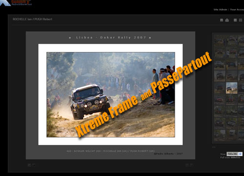
- More information at: Gallery2:Themes:x_treme:Xtreme_Frame
